Hi.
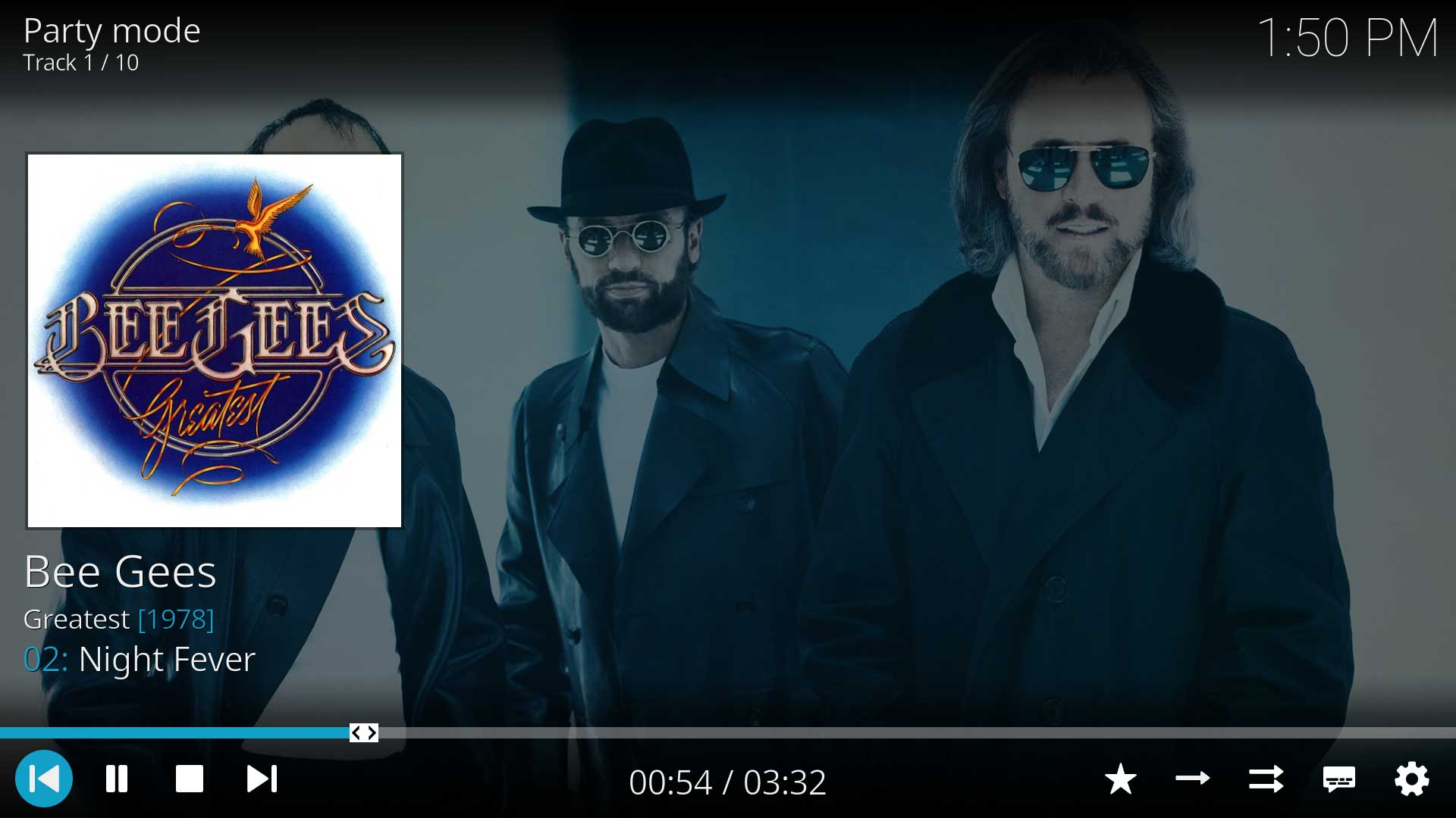
A few years back I used Kodi for my music library (probably version 19, I’m not sure). The “Now Playing” screen was minimalistic, with only the essential information for the song. Both for the control and info screens. It looked something like this: Artist, Album, Track number, Track title. Enough info.
https://kodi.wiki/view/File:Music-NowPla…ntrols.jpg
 Now I re-installed Kodi again, and the new Playing Now screen has a lot of information that takes a lot of screen space. Like year, stars rating, Next Song (??) , and all the little squares with the technical info
https://photos.app.goo.gl/ghyfviZn3oz5a4Bu6
My question is…. is there a way to customize the Playing Now screen to all this (IMO) unnecessary things? I would like to be able to chose what fields are displayed in the Playing Now screen.
I looked at all the settings and the skin settings also but could not find anything.
Thanks so much
Gonzchi
